Exploring anime inspired toaster designs
Outline:
– Why anime-inflected product design resonates in the kitchen and how lifestyle trends drive demand.
– Translating visual language: color theory, forms, motifs, and finish choices that survive real heat.
– Engineering for safety and longevity: coatings, adhesives, testing, and compliance considerations.
– Interaction and usability: toast quality, controls, feedback, and everyday upkeep.
– Market, ethics, and sustainability: originality, licensing awareness, pricing, and circular design.
Why Anime-Inspired Toasters Matter: Culture Meets Countertop
Pop culture has a habit of sneaking into everyday tools, and the toaster might be the most approachable canvas of all. Anime-inspired toasters demonstrate how functional objects can carry a little narrative spark, merging domestic routine with expressive design. For fans, that spark can create a meaningful micro-ritual; for designers and retailers, it opens a path to differentiation in a crowded small-appliance market. A colorful shell or a stylized silhouette doesn’t just look nice—it can signal identity, community, and taste while still meeting the fundamental requirement: reliably crisp, evenly browned slices.
There’s a practical reason this niche keeps gaining attention. Small appliances are often replaced in multi-year cycles, so people look for pieces that feel fresh without demanding remodel-level commitment. A toaster sits visibly on the counter; unlike a blender stored away, it becomes part of the kitchen’s visual rhythm. When the surface tells a story—whether a heroic motif, a whimsical sidekick shape, or soft gradients borrowed from dreamy scenes—it changes how the space feels. The trick is ensuring the story survives the realities of heat, crumbs, and daily cleaning.
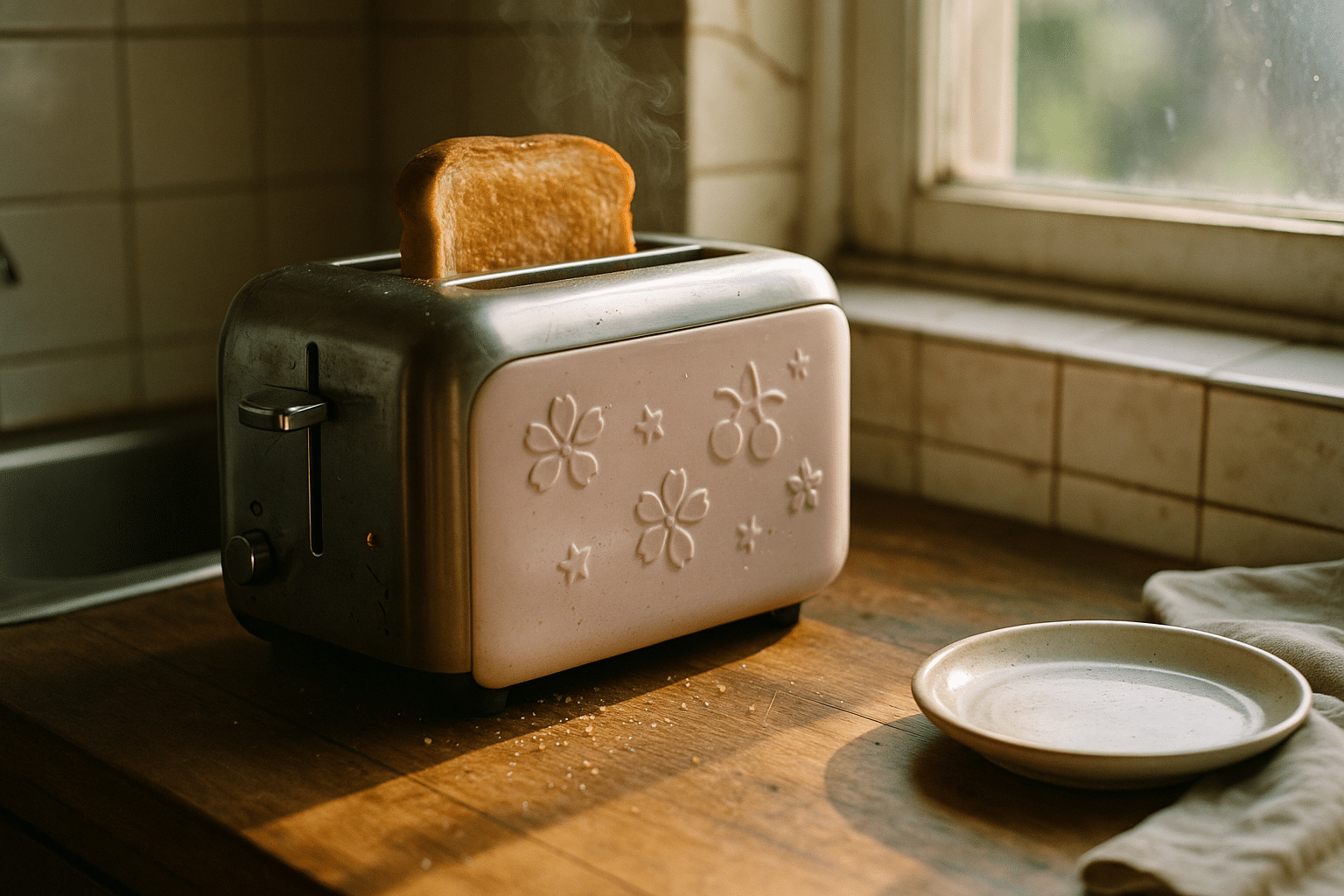
Consider how anime’s variety maps to product form. Bold, angular “mecha” cues make sense on square-bodied designs with crisp edges, while gentle “slice-of-life” vibes pair with rounded corners and pastel finishes. Minimal line art can read clean at a glance; embossed icons add tactile interest without relying on decals. These judgements matter because they control how the toaster ages: smooth curves handle scuffs differently than flat planes; lighter hues can mask dust but reveal stains; darker shells hide heat marks yet amplify fingerprints. A thoughtful scheme anticipates these trade-offs instead of treating decoration as an afterthought.
Useful framing questions for buyers and makers alike include:
– What emotion should the toaster evoke at a glance, and does the form support that emotion?
– Which motifs can be expressed without tiny, fragile details that are hard to clean?
– How will the finish handle daily oils, steam, and wiping with mild detergents?
– Does the design still communicate its theme when the room’s lighting changes?
Aesthetics and Visual Language: From Panels to Panels
Turning drawn worlds into durable hardware begins with a shared vocabulary. Color drives first impressions, so palettes must balance charm with maintenance needs. Pastels feel gentle and friendly, but may require slightly higher-gloss or enamel-like topcoats to protect against stains. Saturated hues signal energy and contrast beautifully with brushed metal accents; however, deep tones can show micro-scratches more readily, making a matte or micro-textured finish appealing. Gradients are beloved in illustration, but on a toaster they work better as subtle shifts baked into coatings or powder blends rather than printed decals that face heat and abrasion.
Form is the second pillar. Many anime aesthetics celebrate iconic silhouettes: compact, chibi-like proportions suggest approachability; elongated, aerodynamic lines whisper speed and futurism. Toasters with softened radii and rounded levers read friendly and casual; squared bodies with beveled faces and geometric vents feel more technical. Be mindful that exaggerated fins or protrusions can complicate cleaning and airflow. The best outcomes use restrained forms that hint at the theme while preserving ergonomics and safety clearances around hot surfaces and crumb ejection paths.
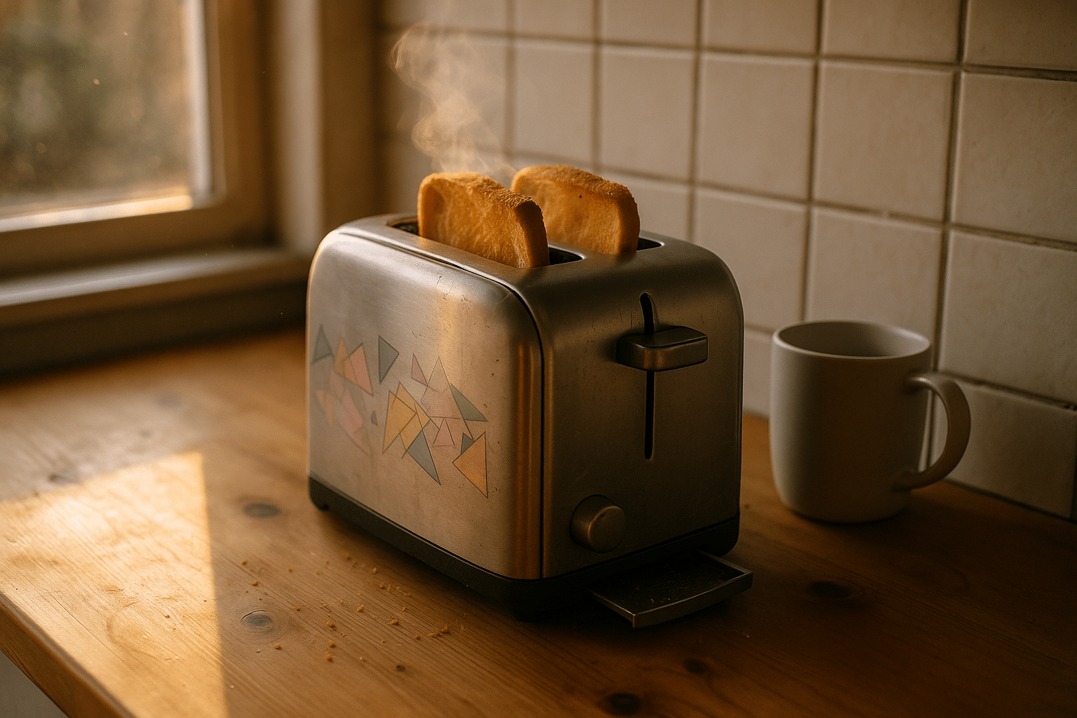
Motifs bring specificity without naming a franchise. Common, non-infringing ideas include stylized stars, gear wheels, sakura-like blossoms, lightning bolts, wave patterns, and abstract frames that resemble dialogue boxes without containing text. These can be expressed as:
– Low-relief embossing in the metal or polymer shell, which resists wear and is easy to wipe.
– Laser-etched patterns on metal faceplates protected by a clear, heat-stable coat.
– Inlay panels made of high-temperature silicone or ceramic-like inserts that add color without paint.
Graphics should avoid tiny corners where oil and crumbs collect. Large, simple shapes age more gracefully and remain legible across the room. If using a two-tone scheme, place lighter colors on upper and front surfaces to visually lighten the appliance and darker shades on high-contact zones like levers or crumb-tray handles. Keep reflectivity moderate; high-gloss finishes can show distortion and smudges under kitchen lighting, while ultra-matte coatings may chalk over time if the chemistry isn’t tuned for heat. A tactically textured surface—subtle orange peel or fine sand—often hides wear while preserving color depth.
Materials, Safety, and Heat: Engineering the Look to Last
Kitchen appliances live in a tough neighborhood: heat spikes, steam, oil mist, and repeated wiping with mild cleaners. An anime-inspired look must be built on materials and processes chosen for this environment. Metal shells—stainless steel or coated steel—offer durability and heat tolerance. Powder coating is a strong candidate for color, as it crosslinks into a resilient film; it can be specified in matte, satin, or gloss with pigments rated for continuous elevated temperatures. Enamel-like coatings provide a glassy sheen and excellent stain resistance, though they add weight and require careful application to avoid edge chipping.
When polymer parts are necessary—knobs, lever caps, or trim—heat-resistant resins with food-contact-safe grades are advisable. Textures molded into these parts can carry motifs without additional printing. If graphics are required, prefer laser etching on metal or ceramic-like transfer processes designed for toasters, rather than vinyl stickers that may curl or discolor. Adhesives must be heat-stable; silicone-based or high-temperature acrylic systems outperform general-purpose tapes near warm surfaces.
Safety underpins everything. Recognized household appliance standards govern electrical insulation, leakage currents, stability, and accessible surface temperatures. Designers should model airflow around heating elements to avoid hotspots at decorated zones, and add thermal barriers between the hot chassis and the outer shell. Accessible surfaces should stay comfortable to touch during normal operation; vent placement, double-walled construction, and strategic air gaps help. Paint and pigments need documented temperature ratings and migration safety for incidental contact. Edges on embossed motifs must be rounded to prevent debris buildup and to make cleaning with a soft cloth effective.
Durability testing is where art meets reality:
– Thermal cycling: multiple heat-up and cool-down runs to catch micro-cracking in coatings.
– Wipe and abrasion tests: simulate cleaning with microfiber and mild detergent over hundreds of passes.
– UV and humidity exposure: protect colors from fading near windows and from kitchen moisture.
– Impact and scratch checks: evaluate resilience when a utensil brushes the surface or a crumb tray snaps in.
Finally, serviceability extends lifespan. A removable crumb tray prevents scorching odors that might stain light-colored finishes. Screws that allow shell removal aid repairs and reduce waste. When aesthetics and maintenance align, the toaster keeps its charm long after the initial unboxing shine.
Interaction and Usability: Features That Feel Like a Story
Design is also how a product behaves. Anime-inspired cues can inform interaction patterns without gimmicks. A lever with a soft arc suggests a gentle, friendly action; a knurled dial with geometric facets feels precise and technical. Backlit indicators can reference scene-like glows—warm ambers for toasting progress, cool blues for standby—while remaining subtle and energy-efficient. Sound feedback should be simple and original, such as a soft chime on completion, avoiding recognizable melodies. The aim is to echo a mood, not quote a specific source.
Toast quality remains the baseline. Even heating depends on element distribution, reflector geometry, and slot spacing. Wider slots add versatility for bagels and artisan slices but demand stronger springs and attentive centering guides to avoid uneven browning. A robust timer, whether mechanical or electronic, should produce consistent cycles across power fluctuations. Features that serve both function and theme include a “peek” lift to check progress without canceling, a warm-keep mode that pulses gentle heat, and a crumb management system that prevents buildup beneath decorated surfaces.
For usability, think in systems:
– Controls: Large, readable icons using shapes rather than text retain thematic coherence and accessibility.
– Feedback: A segmented progress light ring is intuitive and avoids distracting animations.
– Cleaning: Rounded interior corners and a full-width crumb tray reduce scorch marks that could discolor pale finishes.
– Safety: Auto shutoff and lift-to-cancel keep attention on the fun without compromising responsibility.
Comparing control approaches helps. Mechanical dials are tactile, affordable, and reliable; they pair well with vintage or cozy aesthetics. Digital controls allow presets and finer repeatability, suiting modern, high-contrast styles. Both can be framed by the same visual language if the housing, lever, and indicators share motif logic. For example, a “heroic” theme might use bold chamfers and metallic accents on a mechanical dial, while a “serene” theme employs softly beveled glass-like lenses over minimal LEDs. In either direction, keep the story secondary to clarity: the right slice, first time, without guesswork.
Market, Ethics, and Sustainability: Bringing Concepts to the Table
Anime-inspired products sit at the intersection of fandom and function, which means market choices are as much about values as they are about features. Original designs that draw from broad genre language—stars, blossoms, abstract frames, mechanical motifs—offer creative freedom and clear ownership. Licensed collaborations, when applicable, require formal agreements; without them, avoid direct character likenesses or distinctive symbols. Consumers benefit from transparency: clear sourcing, honest materials descriptions, and realistic claims about durability and performance.
Pricing typically follows build decisions. Powder-coated metal shells, multi-part molds for embossed motifs, and ceramic-like inserts add cost but also longevity. A thoughtful way to structure options is a tiered lineup:
– Core: reliable heating, clean two-tone coating, simple geometric motifs.
– Enhanced: textured knob materials, segmented progress indicator, removable panel accents.
– Collector: numbered colorways, alternate motif plates, premium enamel-like finishes with expanded quality testing.
Sustainability can be a differentiator without sacrificing charm. Use coatings with low volatile emissions and select resins that support recycling. Designing the shell with fasteners rather than permanent welds allows refurbishment and replacement of worn controls or panels. Offering spare lever caps and interchangeable motif plates encourages repair over replacement. Packaging can echo the theme using monochrome line art on recycled board, avoiding plastic windows and foam.
Distribution and community engagement should match the spirit of the product. Small batches can launch through specialty retailers and maker fairs, where tactile evaluation matters. Clear photos showing real wear scenarios—crumb tray removal, close-ups of texture, and color under daylight—build trust. After-sale support, such as accessible manuals and honest cleaning guidance, turns a stylish object into a long-term companion. Above all, resist overstatement; users appreciate appliances that toast evenly, clean easily, and add a smile without demanding special care.
Conclusion for buyers and creators: choose originality, verify materials, and plan for maintenance. Let the theme enrich, not overshadow, the daily task. When story and service align, the morning counter becomes a quiet stage—one that delivers golden slices and a little spark of joy, on time, every time.


